http://www.youtube.com/watch?v=KUA81Z7WGBE&feature=player_embedded
There were a few spots in our presentation were I think we could of explained better. I think we could of actually shown what the levels would of looked like because without them, I think it was kind of hard to visualize what the delimiters or the rules are. I also think we could of shown a picture of what the platform would look like. It was kind of self explanatory when we said it was meant for cellphones but a visualization would of made it more clear what the classic side scroll would look like. So overall, more visualizations would of made this presentation better.It would of also been better if we had explained why we chose to play that music at the end instead of just playing it and letting the audience to guess what it was.
I think the concept we did the best with was the mechanics. In our presentation, we showed the controller and explained in depth what each button did. we also showed pictures of what the actions looked like so when we were explaining the attack button, we would show the hero attacking the villain.
blog1
Friday, July 22, 2011
Blog 4.1
http://sh269608.blogspot.com/2011/07/my-stop-motion.html?showComment=1311376939976#c4765408985964483285
http://kirbykilwalski.blogspot.com/2011/07/cost.html?showComment=1311378197157#c3239868300708569296
http://artistmdia.blogspot.com/2011/07/mdia-203-project-3-animation.html?showComment=1311379208994#c1290060121666234813
http://kirbykilwalski.blogspot.com/2011/07/cost.html?showComment=1311378197157#c3239868300708569296
http://artistmdia.blogspot.com/2011/07/mdia-203-project-3-animation.html?showComment=1311379208994#c1290060121666234813
Thursday, July 21, 2011
Saturday, July 16, 2011
Blog 3.1


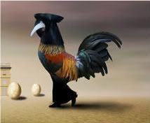
The pictures above are chosen from the artist Ben Goossens. As you can tell, the one on the bottom is the original one and the one on top is the re-framed one. As you can tell, these two photos share a lot more affinity in comparison. The reason why I re-framed this part of the photo is because I think that this part of the photo goes along a lot better by itself than using the whole photo as one. The re-framed photo has a lot more contrast to it than the original photo itself because the line and shape of the bird is more abstract whereas the egg in the cage is a lot more concrete. The lines being perceived by the cage and the egg are both going the same way. the face in the egg is facing up so there is this virtual line being perceived which goes parallel to the direction of the lines on the cage. You can also see the school building in the far background making these lines going vertical. The eggs are even standing straight up, creating another virtual line going vertical. The type of shot that is being used in both these photos is an extreme long shot. The reason for this is because you can see a very long horizon and you can not even see where it stops. the depth cues in the re-framed picture has really changed since I took out the main object in the original picture. The original picture had a very large foreground object which the bird-like creature used for a sense of depth. Now that the cage with the egg in it was removed, the bird-like creature now uses the school building as a background object for sense of depth. In the new re-framed picture, you can also see a couple of eggs that the bird can also use as a sense of depth.
Subscribe to:
Comments (Atom)